Somewhere between the ad spend and the "why isn't anyone buying" meeting, most businesses skip the one step that actually matters: checking whether their website is quietly sabotaging every visitor it works so hard to earn. Traffic isn't the problem for most sites. Conversion is. Here are the seven mistakes we see most often, in order of how often they show up.
1 THE VAGUE HEADLINE
Your headline could belong to any of your competitors
"Welcome to [Company]" or "Quality Service You Can Trust" tells a visitor nothing about why they should stay. A headline that could sit unchanged on a competitor's homepage isn't doing its job — it's just decoration at the top of the page.
FIX →Name the specific problem you solve and who you solve it for, in one sentence. If it's generic enough to work for any business in your category, rewrite it.
2 COMPETING CALLS-TO-ACTION
Four buttons, four different asks, zero clarity
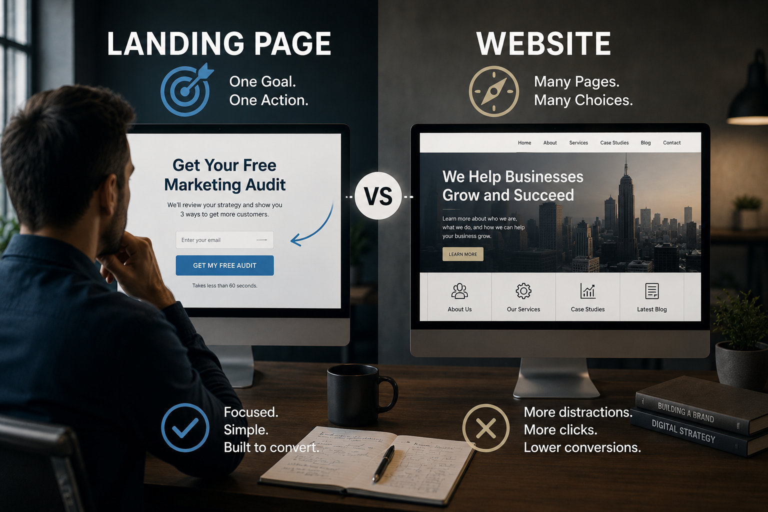
"Learn More," "Contact Us," "Get Started," and "Book Now" all fighting for the same click isn't giving visitors options — it's making them do the work of figuring out what you actually want them to do. Most won't bother.
FIX →Pick one primary action per page. Word it the same way everywhere it appears, and make it visually obvious which button matters most.
3 SLOW LOAD TIMES
The mistake that quietly kills every other fix on this list
It doesn't matter how good your headline, your offer, or your design is if over half your visitors leave before any of it loads. This is the one mistake that makes every other item on this list irrelevant to the visitors who never saw them.
FIX →53% of visitors abandon a page that takes longer than 3 seconds to load. Test your actual load time on mobile, not just desktop — that's where most of your traffic is anyway.
4 FAKE OR MISSING SOCIAL PROOF
A stock quote next to a stock photo convinces nobody
Generic testimonials ("Great service! - J.D.") read as filler, not proof, because they are filler. Visitors have gotten very good at pattern-matching fake credibility, and a page with no real proof at all is barely better — it just reads as untested.
FIX →Use real names, real results, and specific numbers where you can. Visible trust signals have been shown to lift conversion by up to 32% — but only the real kind.
5 FORMS THAT ASK FOR TOO MUCH
Every extra field is a reason to close the tab
A contact form asking for name, email, phone, company size, budget range, and "how did you hear about us" before someone's even talked to you is a filter — just not the kind you want. It filters out people who were interested but not yet committed enough to fill out a job application to reach you.
FIX →Ask for the minimum you need for a first conversation — usually name and email or phone. A simple, short form converts at roughly 23% versus 16% for a complicated one. Get the rest of the information on the call.
6 NO MOBILE-FIRST THINKING
"It doesn't look broken on a phone" isn't the same as mobile-friendly
Most sites are still designed on a desktop monitor first and checked on mobile last, as an afterthought. But most of your visitors are on their phone, often one-handed, often distracted, with far less patience for tiny buttons and horizontal scrolling than whoever approved the design ever tested for.
FIX →Design and test the mobile version first, not last. Mobile conversion rates commonly run roughly half of desktop's — that gap is recoverable, and most businesses just quietly accept it instead.
7 NO WAY TO CAPTURE THE "NOT YET" VISITOR
Most visitors won't buy today. Most sites have no plan for that.
The overwhelming majority of anyone who lands on your site isn't ready to buy in that exact moment — and a site built only for the visitor who is ready right now quietly lets everyone else walk away for good, with no way to reach them again.
FIX →Give the "not ready yet" visitor a genuinely useful reason to leave an email — a guide, a checklist, a real resource, not just "subscribe to our newsletter."
A website that only works for visitors who were already going to buy isn't converting. It's just getting out of the way.
By the numbers
None of these are guesses — here's the research behind each fix above.
53%Of visitors abandon a page that takes longer than 3 seconds to load.
+32%Conversion lift from visible, real trust signals — testimonials, guarantees, security badges.
23% vs 16%Conversion rate for a simple, short form versus a complicated, lengthy one.
~50%Roughly how much lower mobile conversion rates run compared to desktop, on average, when mobile is treated as an afterthought.
+45%Conversion lift from adding live chat — largely from catching visitors who weren't ready to fill out a form.
+14%Conversion lift from placing social proof directly next to the call-to-action, instead of elsewhere on the page.
Figures are drawn from published 2025–2026 conversion-rate-optimization research (VWO, industry CRO benchmark studies, and related sources), cited directionally to show the shape of the impact rather than a guarantee for any specific business.
The bottom line
None of these seven fixes require a full redesign, and none of them require a bigger ad budget. They require someone actually looking at the site the way a stranger would, once, honestly. Most businesses spend far more money sending traffic to a page than they ever spend fixing what happens once that traffic arrives — which means the cheapest, highest-leverage marketing move available to most companies right now isn't a new campaign. It's fixing the seven things above.
Want to know which of these seven your site is actually making?
MindActive will run the audit for free — no pitch attached.
Get Your Free Website Teardown