


How to Turn Your Website Into a 24/7 Sales Machine
Somewhere out there is a salesperson who never sleeps, never calls in sick, never has an off day, never gets defensive when someone asks a hard question, and is fully booked meeting with prospects at 2:47 a.m. on a Tuesday. You already pay for this salesperson. You call it "the website." Most businesses just never trained it.
That's the whole premise of this post, and I'm not going to bury it: your website is either working like a sharp, tireless salesperson right now, or it's working like a very expensive framed poster of your logo. There is very little in between. Let's fix that.
The brochure vs. the salesperson
A brochure's job is to exist. It sits there, looking professional, telling people what you do, and quietly hoping someone reads far enough to care. A salesperson's job is completely different — a salesperson greets you, figures out what you actually need, builds enough trust to be believed, makes a specific case for why you should act, handles your "yeah, but..." before you finish the sentence, and then asks for the sale. Directly. Out loud.
Most business websites are gorgeous brochures. They have a nice hero image. They list services. They have an "About Us" page with a team photo everyone hates. What they don't have is a single moment where the site does what a good salesperson does on instinct: reads the room, builds the case, and asks for the close. That's not a design problem. It's a job description problem — nobody ever told the website what its actual job was.
The anatomy of a 24/7 sales machine
Picture your best salesperson — the one everyone secretly wants running every deal. Here's what they do in the first conversation, mapped directly onto the seven things your website needs to do, in order, before a visitor leaves.
Your hero section has about 5 seconds to earn the next 5 seconds
A good salesperson doesn't open with a company history lecture. They open with something that makes you think "okay, this might actually be relevant to me." Your hero section's only job is the exact same thing — one sentence that makes the right visitor think that's me, keep talking, and makes the wrong visitor self-select out before you waste each other's time.
Not every visitor wants the same conversation
A good salesperson doesn't pitch a first-time buyer and a 10-year client the same way. They read who's in front of them and adjust. Your website does this through navigation and structure — clear paths for "I'm just looking," "I'm comparing options," and "I'm ready to talk right now," instead of forcing every visitor down the identical generic path.
Nobody buys from a stranger, even a well-dressed one
This is the stage most websites skip entirely, and it's the most expensive skip on the list. A good salesperson earns trust with specifics — a client they helped, a number they can point to, a guarantee that removes your risk. A logo wall and a stock photo of a handshake do not count. Real testimonials, real numbers, and real faces do.
Features tell. Benefits sell. Your website is probably only telling.
"We offer 24/7 support" is a feature. "You'll never be stuck waiting on hold while your site is down" is a benefit — and it's the same fact, aimed at the thing the visitor actually cares about. A good salesperson translates every feature into a reason it matters to this specific person. Most websites just list what they do and assume the visitor will do the translation themselves. Most visitors won't. They'll just leave.
The best salespeople bring up the objection before you do
"This is probably more expensive than you think" — said by the salesperson, before you asked. It's disarming, and it works because it's honest. Your website can do the same thing with a real FAQ section, transparent pricing (or at least pricing logic), and a plainly stated guarantee. Burying your objection-handling in a "Contact Us" form that makes people ask isn't handling the objection. It's hiding from it.
At some point, a good salesperson actually asks for the business
This sounds obvious and it's the single most common failure point on business websites. There's no clear, singular, unmissable next step. There are four buttons that all say slightly different things ("Learn More," "Contact," "Get Started," "Book Now") competing with each other for the same click. A good salesperson asks for one thing, clearly, at the natural moment. Your website should too — one primary CTA, repeated consistently, worded the same way every time.
Not everyone buys on the first conversation — a good salesperson doesn't disappear either
Most visitors aren't ready to buy today. A good salesperson doesn't just shrug and let them walk out; they get a way to follow up. Your website's version of this is an email capture, a lead magnet, or a live chat that responds fast enough to matter — not a silent "maybe they'll remember us and come back" hope.
A brochure hopes you'll come back. A salesperson gets your number before you leave.
By the numbers
None of this is a hunch. Here's what the 2026 conversion research actually shows about each lever above.
Figures are drawn from published 2026 conversion-rate-optimization research (VWO, industry CRO benchmark studies, and related sources), cited directionally to show the shape of the impact rather than a guarantee for any specific business.
The 5-minute audit: is your website actually selling?
Pull up your own homepage right now, on your phone, like a stranger would. Go through this list honestly.
How people accidentally mute their own salesperson
Nobody sets out to build a website that goes silent at the exact moment a visitor needs convincing. It happens by a thousand small, well-intentioned decisions. Here's the pattern we see most often:
- Leading with company history instead of the visitor's problem. "Founded in 2003..." is a fact about you. It's not a reason for anyone to care yet.
- Four different CTAs fighting for the same click. A confused visitor doesn't pick the "best" option — they pick none of them.
- Treating the FAQ page like a legal formality instead of a sales tool. It's often the most-read page on the entire site, and most businesses write it like nobody will ever open it.
- Optimizing the homepage and forgetting every other page still has to sell too. Visitors don't always land on your homepage first — your services pages and blog posts need a next step too.
- Treating "mobile-friendly" as "doesn't look broken on a phone." Mobile conversion rates run roughly half of desktop's — that gap is recoverable, and most businesses just accept it instead.
What this actually looks like once it's fixed
A prospect lands on your site from a Google search at 9:40 p.m. The headline tells them, in one sentence, that they're in the right place. A real testimonial two scrolls down makes them trust you a little more than they did five seconds ago. The FAQ answers the pricing question they were about to leave to go Google separately. There's exactly one clear button telling them what to do next, and it's the same button they saw three times on the way down the page. If they're not ready, there's a genuinely useful reason to leave an email instead of just closing the tab.
Nobody was awake to sell to them. Nobody had to be. That's the whole point.
The bottom line
You already have a salesperson working the graveyard shift. The only question is whether anyone ever gave it a script. Most businesses spend money on ads to send more strangers to a website that was never actually taught how to close — which is a little like hiring a marching band to bring customers into a store where the cashier is asleep.
Fix the seven stages above, in order, and you're not redesigning a website. You're training a salesperson who happens to never need a lunch break.
Want a second opinion on which stage your site is stuck at?
MindActive will walk your site through this exact framework — free, no pitch attached.

7 Website Mistakes That Are Killing Your Conversions
Somewhere between the ad spend and the “why isn’t anyone buying” meeting, most bus
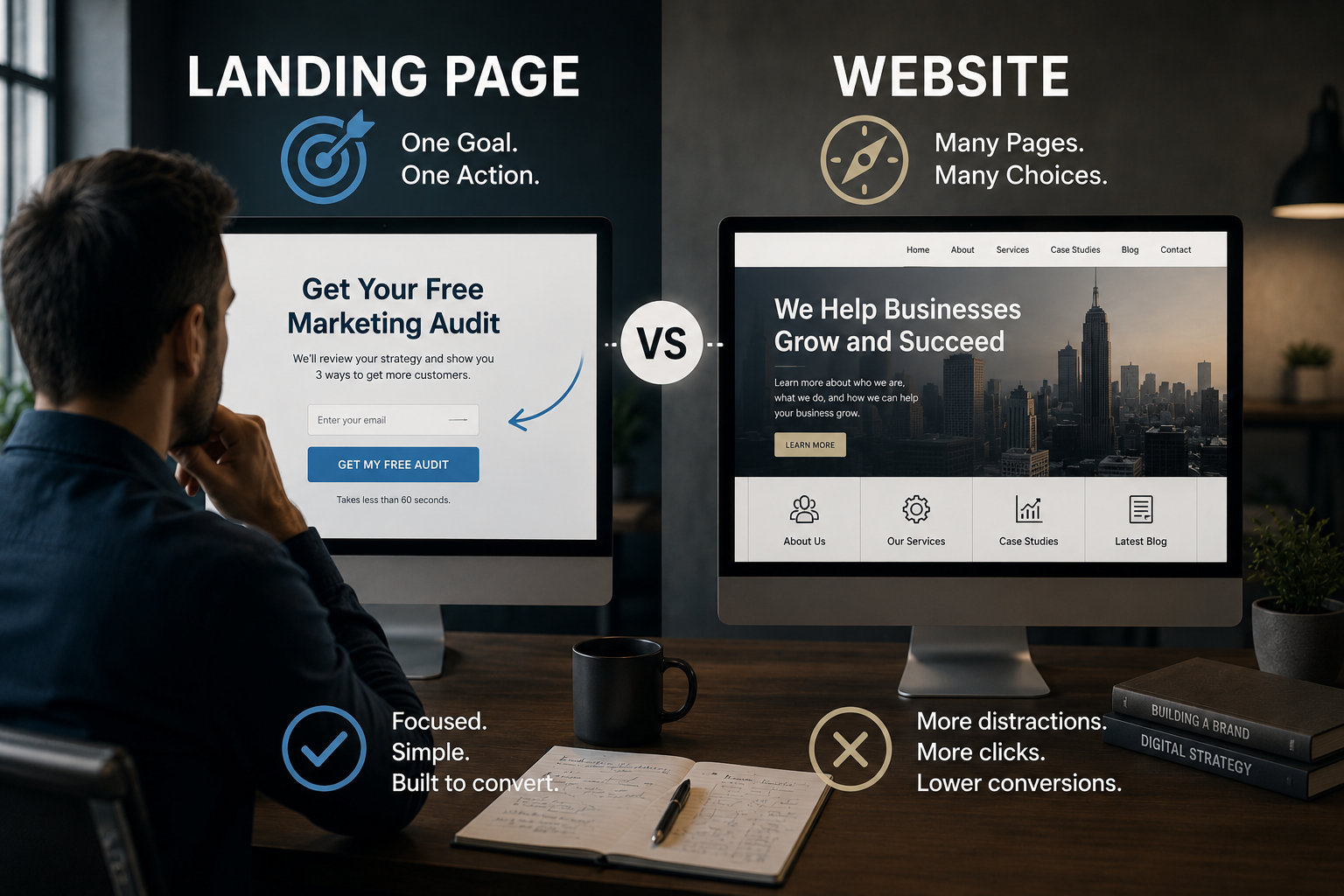
Website vs Landing Page: What Your Business Actually Needs
“We need a website” is the most expensive assumption in small business marketing. Someti
Should You Rebuild Your Website or Optimize It?
Before you spend thousands on a new website, ask yourself one question. Is your website actually the